Crafting a Colour Palette: Your Brand's Visual Identity

Creating a colour palette for your brand is a critical step in building a visual identity that resonates with your audience and communicates your brand’s personality. Here’s a guide to help you craft the perfect colour palette, with insights drawn from my current work on a colour palette for a medispa client.
What Are Brand Colours?
Brand colours are a set of carefully chosen hues that represent your brand. Typically, a brand colour palette includes one or two primary colours and several secondary colours. The primary colours are dominant and are often used in your logo and other key visual elements, while the secondary colors serve as accents and backgrounds.
Why Are Brand Colours So Important?
The importance of colour in branding cannot be overstated. Your brand colours play a crucial role in shaping your overall brand identity and ensuring consistency across all platforms. This consistency creates a brand experience that is instantly recognizable, making your colours synonymous with your brand.
Moreover, colours evoke emotions and can create an emotional connection with your customers. The right colour choices can inspire trust, excitement, and reinforce your brand message. For example, a sustainable brand might lean towards natural, earthy tones.
10 Steps for Crafting Your Perfect Brand Colour Palette
Define Your Brand Before diving into colour swatches, take the time to understand your brand’s internal drivers, target audience, and competition. These factors will inform your brand’s identity and help you make informed colour choices.
Your Brand’s Internal Drivers: Explore what makes your brand unique, its values, and vision.
Your Brand’s Audience: Understand your audience’s needs, behaviors, and emotions.
Your Brand’s Competition: Research competitors to see how they use colours and identify opportunities to stand out.
Balance Standing Out with Industry Representation When selecting brand colours, aim to strike a balance between standing out and fitting into your industry. For instance, while a soothing green is perfect for a medispa, too many competitors using the same colour might prompt you to explore complementary or contrasting options like a natural sand tone.
Consider the Effects of Color Psychology Different colors evoke different emotions:
Yellow: Optimism and happiness (e.g., McDonald’s, Snapchat).
Red: Excitement and passion (e.g., Netflix, Lululemon).
Blue: Trust and reliability (e.g., Facebook, IBM).
Green: Growth and nature (e.g., Starbucks, Whole Foods).
Understanding these associations will help you choose colours that evoke the right emotions in your audience.
Consider the Cultural Context of Colours Colours can have different meanings in different cultures. For instance, red is associated with danger in Western cultures but symbolizes luck in China. Being mindful of these differences ensures that your brand colours are universally appealing and culturally sensitive.
Choose a Few Neutrals Having neutral colours in your palette is essential. They provide balance and versatility, serving as backgrounds or text colours. For the medispa client, I’ve considered pairing sage green with soft greys and cream to maintain a calming and clean aesthetic.
Test Your Colours Once you have a few colour options, test them out. Apply them to a social media template or a mockup of your logo to see how they work together in practice. This will give you a sense of how your colours will look across various platforms.
Think Long-Term, Not Just Trends While it’s important to be aware of trends, your brand colours should primarily reflect your brand’s personality and values. Trends come and go, but your brand’s identity is long-lasting. For instance, while mustard yellow might be trending, it’s unlikely to suit a spa’s calming atmosphere.
Create a Good Ratio for Brand Colours Balance the use of your colours to avoid overwhelming your audience:
60% Primary Colour
30% Secondary Colour
10% Accent Colour
This ratio ensures that your branding is cohesive and not chaotic.
Ensure Accessibility Make sure your colour palette is accessible to all, including those with colour vision deficiencies. High contrast and legible text are essential. I can’t emphasize the importance of this point enough!
Be Consistent Consistency is key. Use your colour palette consistently across all touchpoints—your website, social media, packaging, and more. This consistency strengthens brand recognition and builds trust with your audience.
Conclusion
Creating a brand colour palette is an art and a science. By considering factors such as your brand’s identity, industry standards, colour psychology, and cultural context, you can develop a palette that not only looks great but also resonates with your audience and reinforces your brand message.
For my medispa client, starting with sage green and exploring complementary and neutral tones is helping us create a palette that is both soothing and distinctive, perfectly aligning with the brand’s values and the atmosphere it aims to create.
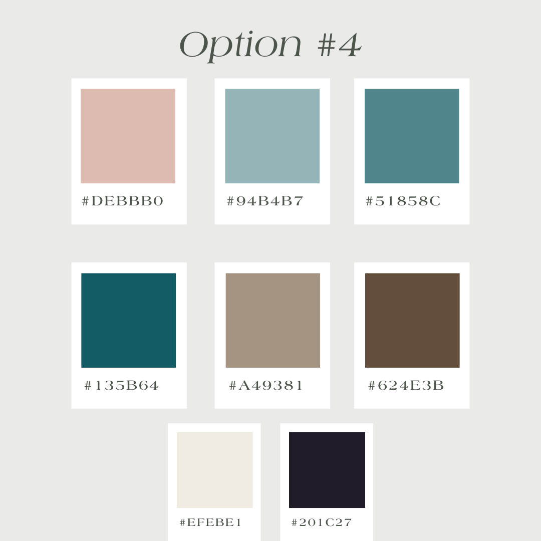
Check out the options I gave my client when we were creating the palette. Which one is your favourite?