
The Power of Fonts: A Simple Guide to Making Your Designs Pop
When creating visual content—whether for a website, social media post, or resume—font choice plays a crucial role in communicating your message. With so many fonts available, deciding which one best suits your brand or project can feel overwhelming. In this guide, I’ll explore three major font styles—serif, sans-serif, and handwritten—and where they work best, along with some practical tips for font pairing, size, and accessibility.
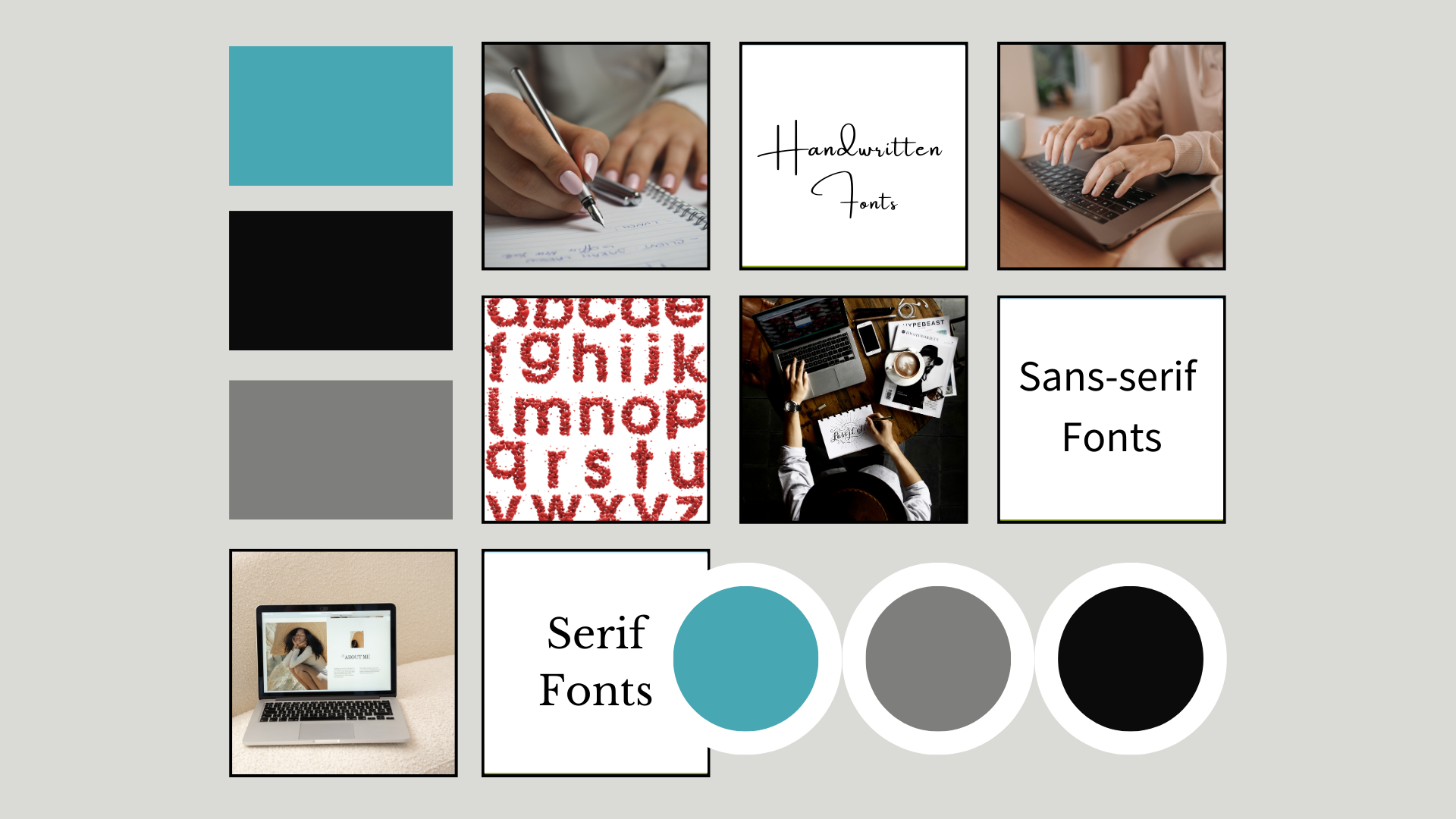
Understanding Serif Fonts
Serif fonts are easily recognized by the small lines or "serifs" attached to the ends of letters. These fonts give a classic, traditional feel, making them perfect for formal or professional settings.
Best Used For:
Websites and blogs with long-form content, as they enhance readability in paragraphs.
Professional documents like resumes, portfolios, and formal reports.
Brands aiming for an elegant, established, or trustworthy image.

My Favourite Serif Fonts
from Canva:
Libre Baskerville: The font I use for both my website and personal social media. It’s clean and easy to read while maintaining a touch of sophistication.
Garamond: Timeless and perfect for printed materials like books or formal documents.
Playfair Display: Popular for headlines and titles, offering a modern twist on the traditional serif.
DM Serif Display and Didot LP: Both are excellent for editorial-style designs, with sharp lines and stylish curves that exude high-end appeal.
The Role of Sans-Serif Fonts
Sans-serif fonts lack the small lines of serif fonts, giving them a clean, modern, and minimalistic appearance. They are frequently used in digital formats and evoke simplicity and clarity.
Best Used For:
Websites, especially for tech companies, startups, or modern brands.
Social media posts where clarity and readability are key.
Businesses aiming for a sleek, contemporary, or minimalist image.

My Favourite Sans-Serif Fonts from Canva:
Source Sans Pro: My go-to sans-serif font for my website and social media. It’s versatile and clean, perfect for both headings and body text.
Bebas Neue: Bold and great for headlines or attention-grabbing graphics—my husband’s personal favorite.
Montserrat, Neue Montreal, Glacial Indifference: These fonts work wonderfully for modern, minimalist branding.
Barlow Condensed: A tall, narrow font that works well in spaces where you need to pack in text without overwhelming the design.
Open Sans: Known for being highly legible, it’s a great choice for both digital and print media.
Handwritten Fonts: Adding a Personal Touch
Handwritten fonts mimic cursive or print handwriting, creating a personal, creative, or whimsical vibe. They work best when used sparingly to add character or a unique accent to your design.
Best Used For:
Accents in social media graphics or personalized greeting cards.
Special touches in designs like invitations, menus, or event posters.
Personal projects or brands that want to convey warmth or creativity.

My Favourite Handwriting Fonts from Canva:
Angelina: A perfect choice for holiday-themed posts, especially Christmas!
Daydream, Playlist Script, Amsterdam One: All three work well as accents for your primary fonts in Instagram posts or invitations.
Tips for Pairing Fonts
When designing, less is often more. Pairing fonts effectively can create visual harmony and help guide the reader’s attention. A common rule of thumb is to pair one serif font with one sans-serif font. Use the serif font for headings or titles to add elegance and the sans-serif for body text to maintain readability.
You can also experiment with contrast. For example, pair a bold sans-serif font like Bebas Neue for headlines with a softer, more traditional serif font like Libre Baskerville for supporting text. This contrast creates a visually dynamic yet balanced design.
Font Size and Weight Matter
Choosing the right size and weight for your fonts can drastically affect the tone of your design. Larger, bolder fonts (like Bebas Neue) are perfect for grabbing attention in headers, while lighter weights and smaller sizes (like Source Sans Pro) make reading long-form content easy on the eyes.
Accessibility: Making Your Content Easy to Read
When choosing fonts, it’s important to keep accessibility in mind. Sans-serif fonts, due to their simplicity, are often more readable on digital screens, especially in smaller sizes. Ensure that your text is legible for all viewers, including those with visual impairments, by choosing fonts with good contrast against the background and avoiding overly decorative fonts for body text.
The Golden Rule: Stick to Two Fonts (With One Exception)
When creating any visual content—whether for an Instagram post, resume, or other document—limit yourself to using only two fonts. This helps maintain a clean, professional look. The one exception is when using a handwriting font; feel free to add it as an accent alongside two other fonts for a more personalized touch.
Conclusion: Let Your Fonts Speak for You
Choosing the right font may seem daunting, but understanding the basics of serif, sans-serif, and handwritten fonts simplifies the process. Fonts do more than display text—they communicate your tone, personality, and professionalism. By selecting fonts that complement each other and keeping your design readable and accessible, you can create visually appealing, effective content that resonates with your audience.
Now it’s time to explore! Check out Canva’s vast font library, experiment with different styles, and see what best suits your brand. Remember, less is more—stick to two fonts and let your designs shine.